Joomla Templates: Creating a Pure CSS Template | Part 4
[next]
Joomla Templates: Creating a Pure CSS Template - Part 4
Making a Real Joomla 1.5 Template
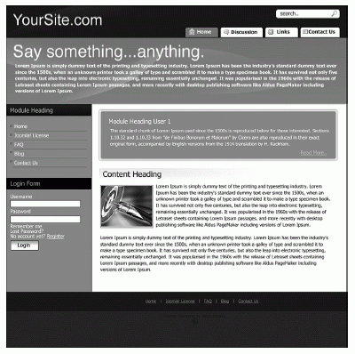
The first thing we need to start with is our comp. A comp is the design that is the basis of the template. We use one kindly donated by Casey Lee, the Lead Designer from Joomlashack for our purposes. It's called "Bold," and we can see it in Figure 9.8.
Slicing and Dicing
The next step in the process is what is known as slicing. We need to use our graphics program to create small sliced images that can be used in the template. It's important to pay attention to how the elements can resize if needed. (My graphics application of choice is Fireworks, because I find it better suited to web designÂas opposed to printÂthan Photoshop).

FIGURE 9.8 A design comp from Joomlashack
Setting Up Module Locations
This template will have some specific locations for specific modules, slightly different from the standard Joomla installation. To make sure the modules are correctly set up as you work through this template, make sure of the following:
|
Nothing else should be published in these locations.
Header
The header image has a faint swish at the top. We want to retain that, so we put the image in as a background and then assign a color also. That way, the header will scale vertically if we need it to; for example, if the font sizes are resized. We also need to change the colors of any type to white so they show up on the black background.
We also use the background image for the search box. We need to make sure that we target the correct input by using CSS specificity. I have also used absolute positioning inside a relatively positioned element to place the search box where I want it. The image will not scale with text resizing with just a single image. That would require a top and bottom image. That's another exercise for you!
I did not use a graphical logo here; I used plain text. The reason is mainly because SEOs, as search engines, cannot read images. One could do some nifty image replacement, but I will leave that as an exercise for you to do on your own.
Our header now looks like what's shown in Figure 9.9.

FIGURE 9.9 Header image background
Next, we need to implement a technique used to show a background on a fluid column: sliding doors.
[next]
URL:


 Digg This
 Find a programming school near you