CSS Mastery: Advanced Web Standards Solutions
[next]
CSS Mastery: Page Layout
One of the major benefits of CSS is the ability to control page layout without needing to use presentational markup. However, CSS layout has gained a rather undeserved reputation of being difficult, particularly among those new to the language. This is partly due to browser inconsistencies, but mostly due to a proliferation of different layout techniques available on the Web. It seems that every CSS author has their own technique for creating multicolumn layouts, and new CSS developers will often use a technique without really understanding how it works. This "black box" approach to CSS layout may get quick results, but ultimately stunts the developer's understanding of the language.
All these CSS layout techniques rely on three basic concepts: positioning, floating, and margin manipulation. The different techniques really aren't that different, and if you understand the core concepts, it is relatively easy to create your own layouts with little or no hassle.
In this chapter you will learn about
|
Centering a design
Long lines of text can be difficult and unpleasant to read. As modern monitors continue to grow in size, the issue of screen readability is becoming increasingly important. One way designers have attempted to tackle this problem is by centering their designs. Rather than spanning the full width of the screen, centered designs span only a portion of the screen, creating shorter and easier-to-read line lengths.
Centered designs are very fashionable at the moment, so learning how to center a design in CSS is one of the first things most developers want to learn. There are two basic methods for centering a design: one uses auto margins and the other uses positioning and negative margins.
Centering a design using auto margins
Say you have a typical layout where you wish to center a wrapper div horizontally on the screen:To do this you simply define the width of your wrapper div and then set the horizontal margins to auto:
In this example I have decided to fix the width of my wrapper div in pixels, so that it fits nicely on an 800600 resolution screen. However, you could just as easily set the width as a percentage of the body or relative to the size of the text using ems.
This works on all modern browsers. However, IE 5.x and IE 6 in quirks mode doesn't honor auto margins. Luckily, IE misunderstands text-align: center, centering everything instead of just the text. You can use this to your advantage by centering everything in the body tag, including the wrapper div, and then realigning the contents of the wrapper back to the left:
Using the text-align property in this way is a hack—but a fairly innocuous hack that has no adverse effect on your code. The wrapper now appears centered in IE as well as more standards-compliant browsers (see Figure 7-1).
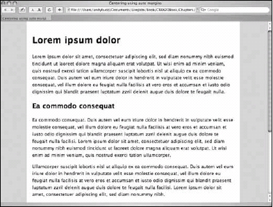
Figure 7-1. Centering a design using auto margins
There is one final thing that needs to be done in order for this method to work smoothly in all browsers. In Netscape 6, when the width of the browser window is reduced below the width of the wrapper, the left side of the wrapper spills off the side of the page and cannot be accessed. To keep this from happening, you need to give the body element a minimum width equal to or slightly wider than the width of the wrapper element:
Now if you try to reduce the width of the window below the width of the wrapper div, scroll bars will appear, allowing you to access all of the content.
[next]
URL:
 Find a programming school near you