WebReference.com - Part 1 of chapter 5 from Information Architecture for the World Wide Web, 2nd Edition. From O'Reilly (8/8).
[previous] |
Information Architecture for the WWW, 2E. Chapter 5: Organization Systems
Metaphor
Metaphors are commonly used to help users understand the new by relating it to the familiar. You need not look further than your desktop computer with its folders, files, and trash can or recycle bin for an example. Applied to an interface in this way, metaphors can help users understand content and function intuitively. In addition, the process of exploring possible metaphor-driven organization schemes can generate new and exciting ideas about the design, organization, and function of the web site.
While metaphor exploration can be useful while brainstorming, you should use caution when considering a metaphor-driven global organization scheme. First, metaphors, if they are to succeed, must be familiar to users. Organizing the web site of a computer hardware vendor according to the internal architecture of a computer will not help users who don't understand the layout of a motherboard.
Second, metaphors can introduce unwanted baggage or be limiting. For example, users might expect a digital library to be staffed by a librarian that will answer reference questions. Most digital libraries do not provide this service. Additionally, you may wish to provide services in your digital library that have no clear corollary in the real world. Creating your own customized version of the library is one such example. This will force you to break out of the metaphor, introducing inconsistency into your organization scheme.
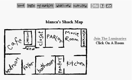
In the offbeat example in Figure 5-8, Bianca has organized the contents of her web site according to the metaphor of a physical shack with rooms. While this metaphor-driven approach is fun and conveys a sense of place, it is not particularly intuitive. Can you guess what you'll find in the pantry? Also, note that features such as Find Your Friend don't fit neatly into the metaphor. While these metaphor-driven "sitemaps" were popular in the early days of the Web, they have become a dying breed, as coolness loses ground to usability.

Figure 5-8: Bianca's metaphor-driven Shack Map
Hybrids
The power of a pure organization scheme derives from its ability to suggest a simple mental model that users can quickly understand. Users easily recognize an audience-specific or topical organization. And fairly small, pure organization schemes can be applied to large amounts of content without sacrificing their integrity or diminishing their usability.
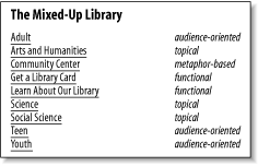
However, when you start blending elements of multiple schemes, confusion often follows, and solutions are rarely scalable. Consider the example in Figure 5-9. This hybrid scheme includes elements of audience-specific, topical, metaphor-based, task-oriented, and alphabetical organization schemes. Because they are all mixed together, we can't form a mental model. Instead, we need to skim through each menu item to find the option we're looking for.

Figure 5-9: A hybrid organization scheme
The exception to these cautions against hybrid schemes exists within the surface layer of navigation. As illustrated by eBay (see Figure 5-6), many web sites successfully combine topics and tasks on their main page and within their global navigation. This reflects the reality that typically both the organization and its users identify finding content and completing key tasks at the top of their priority lists. Because this includes only the highest priority tasks, the solution does not need to be scalable. It's only when such schemes are used to organize a large volume of content and tasks that the problems arise. In other words, shallow hybrid schemes are fine, but deep hybrid schemes are not.
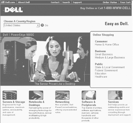
Unfortunately, deep hybrid schemes are still fairly common. This is because it is often difficult to agree upon any one scheme, so people throw the elements of multiple schemes together in a confusing mix. There is a better alternative. In cases where multiple schemes must be presented on one page, you should communicate to designers the importance of preserving the integrity of each scheme. As long as the schemes are presented separately on the page, they will retain the powerful ability to suggest a mental model for users. For example, a broader look at the Dell home page in Figure 5-10 reveals a geographical scheme, an audience-oriented scheme, and a topical scheme. By presenting them separately, Dell provides flexibility without causing confusion.

Figure 5-10: Dell provides multiple organization schemes
[previous] |
Created: September 23, 2002
Revised: September 23, 2002
URL: https://webreference.com/authoring/design/information/iawww/chap5/1/8.html


 Find a programming school near you