Graphic Greats: Production Graphics with Wendy Peck at webreference.com | 30
 |
Graphic Greats: Navigation Graphics |
|
|
In the last Graphic Greats, we took a look at navigation systems. While I was gathering examples for that article, I went a little overboard ... well, maybe more than a little. When I surfaced from my search and sorted through the bounty, I discovered that I had enough for two features. I also received a lot of "thank you" mail about the first one. It seems that many of you struggle with navigation ideas. I can add quite well, and the answer to this particular 2+2 question is Navigation Graphics 2. Professional designers are constantly seeking the perfect way to present clear, functional navigation, while presenting the correct image for a client. There is probably no greater challenge in Web design. This collection of navigation samples illustrates how innovative designers have achieve this goal. If you did not see the first edition, make sure you check out Navigation Graphics. |
||
|
|
||
|
This site is the pinnacle of simplicity, right down to a complete lack of any JavaScript.
Design details like the eye-pleasing curved shape of the menu line and strong color make this site simple, but a long way from "boring." Images © Cole and Mason. |
Cole and Mason The menu is a simple text list, held as a unit by a curved line with points at each menu item. The site is so clearly laid out that, even without mouseovers, there is no doubt about location or purpose for the links. Why try to make a site complicated when simplicity can look so good and perform so well? The strong color prevents any plain look, and if you visit the site you will notice that the design is strong. Perhaps we can compare this site to a well-cut jacket. The quality shows even without any flashy features.
|
|
|
|
||
|
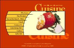
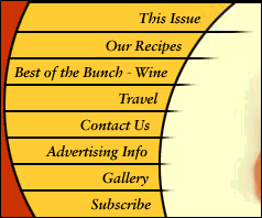
Italic text, a curved shape borrowed from the photo and texture provided by the rough line endings add up to a beautiful and functional entry page. |
Cuisine Magazine The photo adds significantly to the menu ... or does the menu enhance the photo? I suspect the photo may have been the base for the menu design. Note how the curve of the menu replicates the general line of the strawberry. I especially like the lines with their rough ends. They enforce the curve, but also add texture to a look that could have been too perfect. The chopped bottom "Cuisine" also helps in that department. We love the beauty and simplicity of splash pages. Often that is the only place we get to assert our desire to create beautiful images. This site should be an inspiration to us, especially if we have decided that splash pages are a waste. Why settle for a pretty impression with a simple "Enter" function, when we can have beauty and full navigation in one? Images © Cuisine Magazine. Design by Steve Leggat for World Web Design. |
|
|
|
Graphic Greats IndexNavigation Graphics 2 Start/Graphic Curves |
|
URL: https://www.webreference.com/graphics/
Created: May 3, 2000
Revised: May 3, 2000


 Find a programming school near you