Graphic Greats: Production Graphics with Wendy Peck at webreference.com | 33
 |
Graphic Greats: Navigation GraphicsCreative Text Navigation | |
|
The menu is tucked right under the focal point on the entry page.
The interior pages feature a simple text menu just above the text area. Images © Flip Designs.
|
|
Flip Designs In his own site, Steve has used a simple text menu to make navigation easy throughout the site. The entry page features the menu just under the company name. The interior pages have a black background with the menu showing just above the green text area on each page. There is nothing fancy about this navigation system, and maybe that is the point. You could not call the site dull, yet there is no hunt for navigation. To me, that is the sign of a successful site. |
|
|
||
|
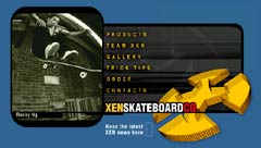
The menu is right beside an attention grabbing photo on the entry page.
The orange bar shown here gives the title for every page, providing your location at a glance. Images © Xen. Designed by Steve Leggat, Flip Designs. |
|
Xen Skateboard The entry page grabs your attention with a superb photo and a slash of gold on a dark page. The menu stands out quite well, and sits right next to the action photo no doubt the first place a skateboarding visitor's eyes will settle. Vivid text descriptions of each menu item appear on mouseover. The interior pages have a completely different look. The menu area at the top stands out well and provides much of the impact for the page. I really like the very subtle animated graphic in the menu area, and I am not usually an animated graphic fan. But this one does not demand all your attention, does draw your eye immediately to the navigation once you look for it, and fits with the subject. An orange bar carries the current page name, leaving no doubt where you are in the site. Everything is laid out very neatly, yet there is an easy casual feeling to the site. It is plain that the focus is skateboarding, yet it is a serious business site at the same time. Let's see ... how 'bout "corporate with a subtle attitude," or "skateboarding without attitude" ... (still thinking). |
That's it, but before I go ...Learn to watch for special graphics techniques as you surf the Web. We often see great design as a whole without taking the time to put each of the pieces under a microscope. How did they do that? Why does that spot attract attention? The answer is often a very simple, but stunningly creative graphic treatment. Harvest ideas constantly to keep your work fresh and reduce the time it takes you to create great graphics. Check the main graphics page regularly for new additions. Visit our new Links section, and don't forget to send URLs when you find "Graphic Greats." Send links. |
||
|
|
|
|
|
|
Graphic Greats IndexNavigation Graphics 2 Start/Graphic Curves |
|
URL: https://www.webreference.com/graphics/
Created: May 3, 2000
Revised: May 3, 2000


 Find a programming school near you