Graphic Greats: Production Graphics with Wendy Peck at webreference.com | 31
 |
Graphic Greats: Navigation Graphics 2Menus with Icons | |
|
Topics are identified with the same icon throughout the site.
Above: Partial view of the main menu on the front page. Below: Each menu item has a description on the right side of the entry page.
|
CoffeeKid.com The icon use here is one of the best samples I have seen. An icon should help you to identify a subject, and the samples here are top notch. Not only are the icons used in the main menu, and then again on the respective page, but they are also used in a mini site directory, right on the front page. This site directory is more than just a map you can see at a glance what is included on each page. What a great example of an information packed, but very user-friendly site. The illustrations used for the icon are beautiful. The color use it courageous and helps to establish the offbeat tone of the site. Well worth a visit. Oops, I just noticed that the menu item I chose to feature is "Obsessions." That is, of course, simply because it is the first menu item ... certainly not because my friends have a valid claim.
Images © Coffeekid.com. |
|
|
|
||
|
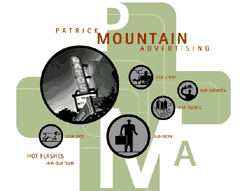
Icons are supported by text which also carries the brick color to the center section of the page.
Interior menu uses a lightened graphic to represent your location in the site. |
Patrick Mountain
Advertising One of the few complaints I have about icons is that they can be cryptic. The benefit of graphic identification disappears if you cannot figure out what a symbol means. The designer has worked an elegant solution to this problem by incorporating text descriptions for the icons into the design. The brick colored lettering adds to the style of the page while it supports the graphic icons. Although the gray and black is an important color in the design, it is used only for navigation, a great trick which makes the menu items jump off the page without being a segregated section. This site has a trendy, artsy look. It is also a testament to the fact that you do not have to give up clear navigation for a great look. Well done. Images © Patrick Mountain Advertising. |
|
|
|
||
|
The entry page features very clear navigation that demands attention and hides nothing.
The interior pages feature classy photographs, yet the icons from the front page fit right in as internal navigation.
|
DryMartini.com The fascinating part to me is that they have changed the mood completely, moving from primary dots, to beautiful photographs on the interior pages. Yet, look in the upper right corner there is the consistency and it works. The icons from the entry page are repeated as internal navigation. I admire that the designer came up with the idea. My brain would have said that it could not work. The fun color dots fit perfectly into the tone of the site, as does the beautiful photography. I came away from this site with a "classy fun" image. What could be more appropriate for a site devoted to martinis? I have seen many sites with split personalities, and believe me, I would not consider bringing them here to show off. But this one is special because it has a split personality that works.
Images © DryMartini.com. |
|
|
|
Graphic Greats IndexNavigation Graphics 2 Start/Graphic Curves |
|
URL: https://www.webreference.com/graphics/
Created: May 3, 2000
Revised: May 3, 2000


 Find a programming school near you