Web Photos that Pop 5: Production Graphics with Wendy Peck at webreference.com
 |
Web Photos that Pop: Don't Be Scared by Print Instructions |
|
|
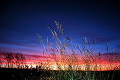
A high quality image has the power to turn an ordinary page into an inviting and artistically pleasing experience. Photo © Tom Thomson Photography. |
There is nothing that can bring a Web site to life like crisp, beautiful photos that load in a flash. When you want to make an impact, add photos. But wait ... a photo is not just a photo. Many of the images that I see in a surfing session are muddy, fuzzy, pixelated and ... well, the page would be better without them. Unfortunately, when you find information about how to improve the look of your photo, make it crisp and adjust the color, you are usually fighting your way through instructions written for print designers. First, let me assure you, writers for print software are not trying to make your life miserable. They are not trying to make you look like a neophyte because you cannot follow everything they talk about. The simple truth is, correcting photos for print is a very precise and complicated matter. |
|
|
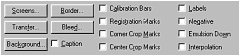
The calibration required for print projects includes options such as those shown above. There is no need for these settings to be used in Web design.
|
Not only must you do everything that we will talk about here, but you must also understand how to calibrate your monitor to the proofing device, which itself must be calibrated to the press that will produce the final product. Dot gain, line screen, trap and choke ... the list of strange terminology goes on. I have great news for you. Unless you are going to be sending an image to print, none of the above means a thing. Not only can you "get away" without understanding what they mean, but not one of the above terms has any place in an image that will be viewed on a monitor. |
|
|
The image above represents a typical untouched result from a scanner or digital camera.
A few adjustments lifts the color and detail from the image, and presents a much more enticing shot. |
However, a lot of the techniques that do apply to Web photos are buried in that print jargon. This article will take you through the basics of photo enhancement, with the following qualifier. I cannot deliver the formula to create a great image every time. Each photo is different, and while we can apply some general rules, there is no magic formula. The whole truth is that you will get really good at enhancing photos in one way and one way only by working with as many photos as you can. Practice and experience truly are the most valuable teachers for fabulous photos. Having said that, I can at least point you in the right direction. There are some adjustments I have applied to almost every scanned photo I have ever worked with over 10 years. I am quite comfortable telling you that a scanned photo will most likely need contrast, levels and sharpening adjustment. I will not be so brave as to predict what the perfect values for each adjustment may be, but it is pretty safe to assume that some will be needed. With the qualifiers out of the way, let's take a look at common photo problems and the solutions. |
|
|
Many photos in this article are from the Hemera Photo-Objects 50,000, Volume 2. The images in this collection are excellent quality. However, for this article I have deliberately wrecked images to represent a common problem in scanned or digital camera images, so that I can show you how to fix them. |
||
|
|
Web Photos that Pop: Tutorial IndexDon't Be Scared by Print Instructions |


Created by Wendy Peck,
URL: https://www.webreference.com/graphics/column49/
Created: July 10, 2001
Revised: July 10, 2001
 Find a programming school near you