Classy Glassy Buttons: Production Graphics with Wendy Peck at webreference.com
 |
Classy Glassy Buttons |
|
|
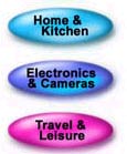
Screaminghotdeals.com features glass look buttons for all navigation.
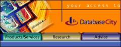
Officepilot.com features file tabs in a texture reminiscent of frosted glass.
Methods to be featured in a later article:
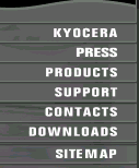
Kyocera presents their menu with 3D dividers close enough to a "button" for me. Another example from the latest Graphic Greats.
Cisco as featured in the latest Graphic Greats. |
You may be questioning why I would be promoting building buttons. That "button" word carries carries some nasty connotations in Web design. Images come to mind like big, purple buttons looking like they are an inch thick, with labels falling over the edges. You all know the type I am talking about. As Web design has become more of an art than a few neat tricks to work in with the programming, designers have tossed out a lot of the standards from a few years back (ancient times in Web language). Buttons need not hit the symbolic burn pile though, since they offer some real advantages. Like mouseovers, which help visitors navigate your site, buttons, more than any other element mean "click here." So how do you add buttons to your site without looking like you have fallen back in time. The one main secret is to work with a light hand. A hint of a button will blend with any design, add some texture to the page and still provide visitors with a clear place to move next. And when I use the word button, I use it quite generally. A "button" does not necessarily have to look like a button it is simply an area that has been set aside by some dimensional texture. Graphic Greats last week featured navigation systems and there were many great examples of texture in the collection. You may want to take a tour after you have seen the techniques here to put methods and ideas together. And keep a sharp eye for great examples. There is fantastic work being done as we speak with the same software we use. We are going to start with a look at buttons with the increasingly popular glass look. Many designers have discovered that glass texture works well on the Web, since glass buttons provide a lot of impact without weighing down the page. Over the next few months, we will look at many different types of buttons. This time we are only featuring PhotoShop and PaintShop Pro, since the glass techniques are similar in the two raster programs. Illustration programs such as CorelDraw or Illustrator handle graduated fills and transparency in a very different way through blends and there is not room for a full discussion of these vector subjects. This is one method that is decidedly easier in a raster program. We start, as usual, with the PhotoShop methods, and everyone should read through that section. There is a lot of general discussion associated with creating the glass look, explanations that make more sense when they are worked in a step at a time as I did with the PhotoShop section. Once you understand the basics, it is just a matter of following a step-by-step for PaintShop Pro. You can have some fun with glass. Keep your eyes open for new examples and add your style to these methods. |
|
|
|
|
|
|
|
Classy Glassy Buttons Tutorial IndexClassy Glassy Buttons Start |

URL: https://www.webreference.com/graphics/
Created: Apr. 25, 2000
Revised: Apr. 25, 2000
 Find a programming school near you