Rough it Up: Production Graphics with Wendy Peck at webreference.com
 |
Rough it Up |
|
|
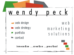
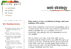
Splash page from my site above and interior page below. https://wpeck.com.
Images © Wendy Peck. Note: If you would like a little more information about site personality, read Web Site Personality Check, an article I wrote for the the webreference.com newsletter in January 2000.
|
Nobody will deny that the level of design on the Web has increased as quickly as the explosion of ecommerce in all its forms. Even smaller businesses are investing in professional design. The "throw it together because people are only interested in the information" type sites are quickly fading from credibility with the credit card carrying public. That is good news for us as designers. But what can you do to make sure that you remain, or climb above the crowd? As visitors eyes become accustomed to the sleek, perfectly controlled commercial sites, you can make an impact by breaking the perfection. Rough up your work and provide a more casual, comfortable mood for your site. Many businesses lend themselves extremely well to a more casual look, and art or design sites will put forward a creative image when they break from a controlled look. I have a sample of my own site as an example of how breaking "neat" rules can add to the look (https://wpeck.com). I have used rough lines and irregular shapes throughout this small site. The layout is traditional, though, since I wanted the information to be easily accessible. As I developed the site, the color and layout came first. The site only started to project what I wanted to say when I replaced the straight lines with rough ones. Not everyone likes this look. One person wrote with an offer to help me find a solution to the "artifacts all over the place" around my lines. But, I think it fits my personality and design style very wellnot too wild or artsy, but not quite coloring within the lines either. If you are looking for a more friendly tone, a little "crooked" or "rough" goes a long way. You do not have to adapt the concept fully to put some of the suggestions to use. Even relatively sleek sites can often benefit from a small graphic or section of text that breaks from tight boundslike the hint of an unusual spice in a great meal. Follow along for some quick methods to "rough up" your pages. Rough it Up Tutorial IndexRough it Up Start
|

URL: https://www.webreference.com/graphics/
Created: Mar. 2, 2000
Revised: Mar. 6, 2000
 Find a programming school near you