Graphic Greats: Production Graphics with Wendy Peck at webreference.com | 14
 |
Graphic Greats 5: Text for Drama | |
|
|
||
|
Rucker Design Group interior page with exceptional text presentation. © Rucker Design Group. Used with permission. |
Rucker Design Group You should visit the site to see how the text is organized by capitalization. Headings are in all caps, main subheads in all lower case letters, and final menu listings shown with first letters as upper case. Not a lot of difference, but on this clean page, it is enough. |
|
|
|
||
|
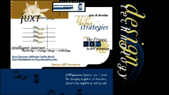
Main entry page for Juxt Interactive.
Close-up view of the entry page top left corner. Note how the split logo effect is repeated in the menu with split font size.© Juxt Interactive. Used with permission. |
Juxt Interactive Note how the lines are used to tie the different areas together and give direction to our eye. Patterns are repeated as well, like the logo split and the text size steps in the menu. Most graphics programs will create vertical text and easily rotate an image, but we rarely see text in a vertical orientation. When the text size is large and the message a secondary one, vertically oriented text can add a lot to a page. The text seems to be geared to artistic appearance, but look for important features, like the menu. It is easy to locate and read. This is one of the secrets to using highly designed textmake sure the reader can still find what they need to find for navigation. If you lose visitors on navigation, all the art in the world will not make your site effective. |
|
|
|
||
|
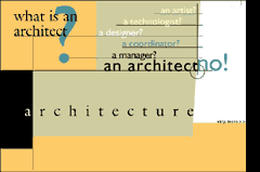
One frame of a Flash introduction to Lundstrom and Associates Architects site, with a wealth of text enhancement examples. The site was created by Juxt Interactive, featured above. (Link to Juxt Interactive will open in a new window. Close that window to return to this page.)
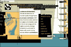
The Profile page in the main site. Note how the lines through the page draw all the separate text areas together. © Lundstrom and Associates. Used with permission. |
Lundstrom
and Associates Architects The main site (the Profile page is shown in the lower image) is carefully divided into sections with rough edged color areas. The main message is easy to read in the white sections, with auxiliary text providing most of the artistic enhancement on the page. Our eye is drawn to art presentation. If that presentation is text, we have the chance to transmit a message. You can learn a lot about tying your page sections together from this site. Try to stretch what you are doing with text now, but go slowly. It takes a seasoned expert to make a site like this one work. Start by adding some text enhancements to your existing style with your next site. And a little more for the next. You will find your style. I will never create designs like this, since my style is much more to white and quite clean. But I do like the rough texture, and will admire and collect ideas for text enhancement, page movement and creating a unified space from very different areas. Although my style will be different, the influence of great sites like this will be felt. |
|
|
|
That's it, but before I go ...Learn to watch for special graphics techniques as you surf the Web. We often see great design as a whole without taking the time to put each of the pieces under a microscope. How did they do that? Why does that spot attract attention? The answer is often a very simple, but stunningly creative graphic treatment. Harvest ideas constantly to keep your work fresh and reduce the time it takes you to create great graphics. Check the main graphics page regularly for new additions. And don't forget to send links when you find "Graphic Greats." Send links. |
|
Graphic Greats IndexGraphic Greats Start |
||
URL: https://www.webreference.com/graphics/
Created: Feb. 23, 2000
Revised: Feb. 23, 2000


 Find a programming school near you