Graphic Greats: Production Graphics with Wendy Peck at webreference.com | 12
 |
Graphic Greats 3: Add Action with Text | |
|
Fashion Institute of Technology entry page.
Interior page close-up from FIT site. Designed by Rewire. © FIT. Used with permission. |
Fashion Institute of
Technology The lower screen shows a close-up of one of the interior pages. Each page features a different color, with the boxes and text presentation method carried throughout. Note how the text size is reduced or enlarged to make the words fit within the constraints. From a graphics creation view, this site is very simple (after you have used years of training and experience to come up with the idea, the design and the balance). Too often, navigation or clarity is sacrificed for artistic presentation. The FIT site presents solid proof that you can have both. |
|
|
|
||
|
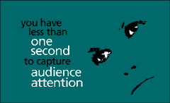
Instantly streaming Flash intro to the Creative Solutions Flash site.
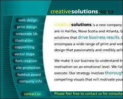
Portion of the main site with selected text highlighted with color. © Creative Solutions. Used with permission. |
Creative Solutions But that is an aside for this feature. It is the text use that caught my attention. Starting with the intro, you will notice how font size and color changes make certain words stand out. It also adds interest and energy to the presentation. The lower sample is a partial view of the main site. The final text in the introduction slides into place as the site appears. Nicely integrated. Note the varied colors in the main text portion. Artistic license? Perhaps, but the different colored text pops out and is carefully chosen. Just read the colored words and you will have the intended message for each page. Great technique and very quick to produce. |
|
|
|
||
|
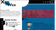
Entry page for XL Web. Text is well used through the page to direct visitors and provide most of the artistic appearance.
Close-up of XL Web logo. © XL Web. Used with permission. |
XL Web The logo is wonderfully presented, repeating the X in outline and working around a simple cutout box. The gray lines help to balance the text. But there is more. The maroon colored band in the center of the site has semitransparent text, and the top bar also features gentle, stylized text. Headlines are also used well to direct the visitor though the page. There is nothing graphically challenging on this site. In fact, the methods presented in the Text as Design tutorial cover them all. Text driven graphics are often like this thoughit is the combination of methods, and the attention to balance that makes them look so good and work so well. Carry on for examples of subtle text effects. |
|
|
|
||
|
|
Graphic Greats IndexGraphic Greats Start |
|
URL: https://www.webreference.com/graphics/
Created: Feb. 23, 2000
Revised: Feb. 23, 2000


 Find a programming school near you