Powerful Photoshop Layers pg 4: Production Graphics with Wendy Peck at webreference.com
 |
Powerful Photoshop Layers: Layer Effects Basics | |||
|
CTRL (Command) clicking on an object in your document will activate the layer for that object. |
SPECIAL TIP: Before we begin working with layer effects, I want to make sure that you know one of the best timesaving tips for working with layers. I find the Auto Select Layer option for the Move tool cumbersome. But you can have quick selecting on demand. With your Move tool active (V), you can activate a layer by CTRL (Command) clicking on an object in the document. The layer that contains that object will be highlighted. Occasionally, especially with small text, it may be hard to find the right spot to click, so confirm that the correct layer is active. However, for most work in Photoshop, this one little tip will save you hours and allows you to work primarily in your document, not constantly moving from the document to the Layers palette.
|
|||
|
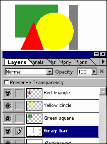
In this sample, note how all objects, except the Gray Bar layer, are surrounded by a transparent background. See what happens when effects are added in the sample to the right. |
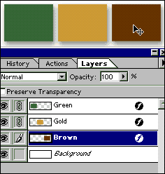
Now that we have done the work, let's have some fun. Photoshop layer effects provide an easy way to add dimension and interest to your images. As usual, I am not going to focus on the wild things you can do with effects, but rather the basic process and how you can speed your work. Still, it is rewarding to watch an object pop right out with a well-placed shadow, or see a plain line turn into a 3D tube before your eyes. Layer effects are added to individual layers. Every item on the layer will receive the effect. Objects must be on a layer with a transparent background, however. If you look at the sample at the left, the "Gray bar" layer is the first one above the white background. Although it appears in the document just as the colored objects, you can see the difference in the Layers palette thumbnails. Note how the white surrounds the gray bar. If a drop shadow was added to this layer, the shadow would appear around the white portion, not the gray. On the colored layers, the shadow will appear for each object, since the layer background is transparent, as shown by the checkered background. The same drop shadow was added to all layers of this sample at the left with the following results.
Note that the gray bar layer shadow follows the white background edge, not the bar. When it appears that your effect is not working, make sure that your layer background is transparent. Note: You cannot apply layer effects to a background layer. However, if you duplicate the background layer, it becomes a standard layer to which you can add effects. I generally duplicate my background layer, and then fill the original background layer with the background color for my image. You can also delete the background layer, or make it invisible, although I find it hard to work on the checkered background. |
|||
|
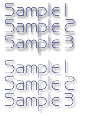
Changing the default effects values will almost always provide better results. In the two samples above, the upper image has default values, and the lower image has had the values adjusted.
|
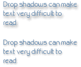
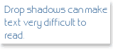
Drop shadows Drop shadow adjustments become more than just an appearance issue when we are talking about text. I have seen many examples of text that is much harder to read because a shadow has been added in extreme cases, it is virtually illegible. In the sample shown here, I applied the default shadow setting to the top sample. For the bottom sample, I reduced the opacity, and distance in the layer effects menu. For very small text, it is most often best to find another method to add dimension to a text area. Look at the three versions of the text below. Although reducing opacity and distance, and increasing the blur helps to make the text more legible, neither sample can hold a candle to the clarity of the third sample. This is simply a white rectangle on the layer below the text. A shadow is added to create a platform for the text, making it stand out and adding texture to the page, yet there is no interference with the text.
The next page will go into detail on adjusting layer effects values and the final page shows you some powerful tricks for working with layers. |
|||
Powerful Photoshop Layers Tutorial IndexPowerful Photoshop Layers Start
|


URL: https://www.webreference.com/graphics/
Created: August 18, 2000
Revised: August 18, 2000
 Find a programming school near you