How to Create User Friendly Web Sites
How to Create User Friendly Web Sites

Excerpted from Prioritizing Web Usability by Jakob Nielsen and Hoa Loranger. Copyright © 2006 Jakob Nielsen. Used with the permission of Pearson Education, Inc. and New Riders. All rights reserved.
Balancing Technology with People's Needs
As technology continues to improve and more users have high-speed access, multimedia Web sites are becoming more prevalent. Done well, video, animation, and sound can enrich the user experience and delight audiences. Implemented inappropriately, multimedia is repellant and reduces your site's value. In this chapter, we'll discuss strategies to help you avoid common pitfalls and use multimedia to your advantage.
In the ten or so years since the Web became a widely used tool, it has turned into a multimedia environment. Many non-technical users have become familiar with following hyperlinks, scrolling to read text, clicking on images to enlarge them, seeing text and images animate, and even using VCR-like onscreen controls to play audio and video. As the technologies that enable people to produce multimedia improve, Web designers and developers are increasingly interested in supplementing their sites' text and images with audio, video, and animation.
But multimedia can be a blessing or a curse. Integrated thoughtfullyÂin proper context and skillfully implemented motion and sound can aid usability, making content not only more entertaining and "immersive," but also more accessible. Unconstrained use of multimedia numbs the sensory experience, creating disruptive interactions and confusing site visitors with a cacophony of sights and sounds. In their enthusiasm for cool new tools, Web designers can lose sight of their primary responsibility: solving communication problems by making information easily available to their audience.
Use Multimedia When It Benefits Your Audience
The most shameful phrase that emerged from the era of superfluous design was "Skip Intro." Garish, overproduced intro pages are inconvenient and arrogant. Making users wait for some pointless animation to download and play is basically saying to them, "We're pushing something we know you don't want, but we're going to do it anyway." Customers resent the lack of control and disregard for their time.
On the bright side, the use of splash pages has dwindled in recent years. Maybe it's just that the novelty has worn off, but more likely the companies have listened to usability experts (and to their users) and are putting multimedia to better use. That said, our previous assertion about multimedia still holds true today. Knowing how much interactivity is appropriate and which tools to use in different situations is essential to creating a successful Web site. Our recent studies show that most multimedia found on the Web these days still trips people up and causes antagonistic reactions. The fancier the design, the buggier it can be and the more problems it's likely to cause. And to make sure it works properly requires more time and effort in quality assurance.
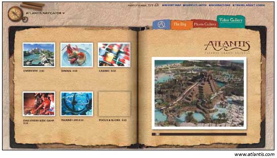
Atlantis.com does a good job of integrating multimedia into its Web site to create a tantalizing experience. While the site is visual, it loads quickly and the navigational elements are relatively consistent. The video gallery is effective because the interaction is simple. Select a picture on the left and the video plays on the right. A main downside, however, is that the site has an annoying splash page that plays every time a user accidentally clicks back too many times or reenters the Web site. There are also some hidden features on the site. For example, you can turn the page by clicking the upper corner of the book. Some people might not discover this, but it's not a big deal because the most important information is readily accessible.
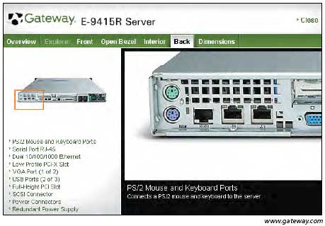
Gateway provides an interactive feature that makes it easy to get close-ups of its products. Move the orange box to areas you want to zoom in on. Click on the green text to go directly to a particular component. No instructions are necessary because this is a simple, one-feature user interface and the interaction model works the way people expect.
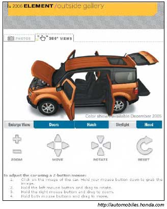
The 3D view of the car is both fun and informative. The designers have accommodated a broad audience by offering multiple ways to control the car, either by clicking the large buttons (easy for everybody) or dragging the mouse across the image (more immersive, but also requiring better mousemanship). The Photos tab gives people the option to see the car without having to manipulate the 3D model. Overall, this is a good implementation of multimedia. It could even be better if people were able to zoom in farther and see more details, such as the dials on the dashboard.
[next] |
Created: March 27, 2003
Revised: May 29, 2006
URL: https://webreference.com/programming/web_usability/1


 Find a programming school near you