Graphic Greats: Production Graphics with Wendy Peck at webreference.com | 28
 |
Graphic Greats: Navigation Graphics3D Graphic Navigation | |
|
The menu bar provides general navigation, and text areas allow one-click access to popular areas.
Such a small change to make this menu bar 3D, but it brings the page to life and makes a very important feature visually prominent. |
|
Gateway Although the entry page is visually very clean, there is a lot here. In addition to the menu bar, there are also text lists and one-click access to (I assume) the most popular items. The designer has obviously thought about what the visitor will be seeking as they arrive, and has done a terrific job of placing most of the site just one click away. This is another site that is well balanced between linear and nonlinear elements. The menu information is in straight lines, and the boxes below mirror that symmetry. However, the rounded, and large text, indents and relaxed groupings for photos prevents the page from being boring or predictable. I really like this unquestionably professional, yet visually exciting and easy to navigate design.
|
|
|
||
|
Three separate menu areas provide great navigation while keeping a very clean look.
Black hairlines help to divide the menu items, but the top and bottom of the menu are defined only by a hint of 3D.
Gentle 3D texture separates the white menu listings, yet has little visual interference.
|
|
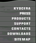
Kyocera The designer here has used a light hand on the menu dividing sections. Note in the close-up of the top menu (shown in the middle at the left) how there is just a hint of a button shape. The depth is enough to separate the menu items, but provides little contrast to pull the eye away from the text. The same idea is used in the side menu. The dividing lines are barely there as far as interfering with the white text, but if they were missing, the white lines would tend to run together without order. Note also that the round photo carries into the menu in the same subtle way. Very nicely done and a method to plant in your toolbox for a future project. When menu items refuse to stand alone, but placing lines ruins the look of the page, use some 3D tricks to have the best of both worlds. |
|
|
||
|
A top menu and a button version of the main photo (close-up below) provide 12 menu items without sacrificing the mood of the page.
|
Cisco I liked the contained but artsy look of this site, partially provided by the menu. A textured copy of the photo on the main page has been "buttoned," but not in the usual way. See the second sample at the left for a close-up view. Though button sized sections have been raised, the background simply carries on from the image. What a wonderful way to integrate a look, or have a menu stand out while still working into the ultimate design. In addition to the image-based menu, the site also contains a top menu for additional information. This page offers 12 menu options to the visitor, yet the menus blend perfectly into the newsletter mood of the page. There are so many ways to integrate graphic menus into your site. For our final set of examples, let's have a little fun and allow the art to take a higher priority. Carry on to the next page for some beautiful examples of graphic menus. |
|
|
|
Graphic Greats IndexNavigation Graphics Start/Graphic Direction |
|


URL: https://www.webreference.com/graphics/
Created: Apr. 20, 2000
Revised: Apr. 20, 2000
 Find a programming school near you