Menus with Beauty and Brains 2 pg 5: Production Graphics with Wendy Peck at webreference.com
 |
 |
Menus with Beauty and Brains 2: Menu Bars for Liquid Design | ||||||||||||
|
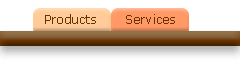
The two simple tables above show how liquid design works. The images forming the text in both the top (100%) and lower (50%) tables is barely larger than the text. <TD> tag background color is providing the illusion that the graphic stretches across the full table width.
The effect is a little more dramatic when we add texture to the background, which, of course, requires a background image. |
Liquid design has become very popular, and is quickly becoming the expected standard for dynamic Web sites. And no wonder ... adding liquidity to your pages can overcome a lot of the problems caused by varied monitor resolutions. Liquid design refers to designs that will stretch and shrink according to the width of the monitor displaying the page. This article is not intended to bring you up to speed on full liquidity, but rather how to work your menu bars into the equation. Tables designed with percentage widths are the heart of liquid design. If you set a table to 100% width, and it contains nothing but text, that table will stretch from edge to edge on the screen, with no scroll, no matter what the viewing window width may be. However, things get a little more interesting when images are added to a table. We know that a graphic will insist on being displayed at its full width. No matter what parameters you specify for a table, if the total width of your graphic exceeds the specified table width, they will force a table to be wider, and force a page scroll if necessary. This is true for fixed or flexible width tables. Without creative table manipulation, we cannot have a color bar that stretches across the page at for all resolutions. The first time I saw my blood, sweat and tears work tucked up into a tiny corner of a cutting edge, super high resolution monitor, I became instantly devoted to liquid design. Of course being devoted to it, and mastering it did not happen at the same time. But I can save you some of the time and trouble I went through with a few simple tricks that form the basis of liquid design for menu bars. Luckily, the solutions are simple. However, there are a few very important things to know in order to make your menu bars work consistently with liquid design. In this article, we are only discussing methods using HTML. |
|||||||||||||
|
The first requirement is a margin command. If you want your menu bars to stretch right to the edges of the page, you must tell the browser to allow zero margins. Often, you will want your content going right to the top of the page as well. To have both Internet Explorer and Netscape Navigator create this effect, you need four additions to your body tag. I have included a sample below, including the standard command for a white background and black text: <body bgcolor="#FFFFFF" text="#000000" leftmargin="0" topmargin="0" marginwidth="0" marginheight="0"> |
||||||||||||||
 |
You must specify a table at 100% width with no cell padding or spacing for the area of the page containing your menu bar. This allows the design elements to stretch to the edge of the page. Hint: If you can keep the design that must stretch right to the edge of page at the top, usually including a logo and the top menu items, you can use tables that stretch to 90% for the rest of the page, and avoid the nested tables required to allow a margin for your content. The image at the left shows the color bars running right to the top and left edge of the page. The right side is the same. Adding the menu graphics to this arrangement is easy. Create your menu items, and place them into the appropriate table cells. I prefer to place all the graphics from a menu into one cell, rather than creating a separate cell for each graphic. You are working with less code, and the results are more consistent across browsers. However, this works only if your menu items are designed to stay together in the same arrangement no matter what the resolution. If you prefer to have your menu items become spread out evenly as the width increases, you will need a separate cell defined for each menu item. |
|||||||||||||
| That's the easy part. It gets a little more fussy once we try to get the color behind the graphics. The secret is the <td> tag. We can place background color and images into the <table> and <tr> tags, but both major browsers play different tricks on backgrounds placed in these tags. Netscape will start the pattern over with every cell, and leave gaps in color, and Internet Explorer refuses to display a background image in the <tr> tag. Backgrounds placed into the <td> tag will display consistently. Warning: Although the display is consistent with the <td> tag backgrounds, Internet Explorer will not print a <td> tag background image. If your page must be printer friendly, make sure your page is not dependent on a background image in a <td> tag. | ||||||||||||||
|
|
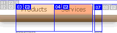
Let's work through a sample. I will place the table on this page, but also provide a simple page, with comments, so you can easily view the code that is producing the results. I have prepared a graphic representation of the menu tabs we created earlier, and have added a bar under the menu tabs. The bar has a contour and a drop shadow. Although I could do this sample in an easier way than we will do, it is a very clear exercise for creating liquid design using backgrounds. You must be very careful with your image slicing when you are using liquid design. One pixel can make a very big difference. I have included the slicing that I did in ImageReady for this exercise. Note how the two menu items include enough distance below the bar to include all of the drop shadow. Also, the third slice is the one that we will use as a background image. It must be the exact same height as the menu items and should be taken from the middle of an image when possible. Effects often produce small changes at the beginning and end of the image. Once the images are saved, with rollovers if appropriate (I am not doing rollovers for this example) you can place the images in your table. In this case, I am going to need only a one cell and one row table. The images are placed side by side, and the image with just the bar is used as the <td> background image.
The bar will expand or contract according to the amount of space it has to fill. You can see an exact copy of this table to the left, but contained within a much smaller space. See a simpler page and view the code. Note: If you view the sample page with Netscape, you will see a gap at the right of the screen, even though the bar should extend all the way. Netscape reserves the room required for the scroll bar, even when it is not needed. I left it without a correction, since this is not a well-known quirk, and is a true hair-pulling type of problem if you are not aware of it. You can fix it easily by making sure that there is enough content on the page, or forcing a scroll area with <p> tags. As long as you remember to place your background commands in the <td> tag, and plan your effects carefully before slicing, creating menus that expand and contract with your page is not difficult. And it does make such a difference in how your page looks. It is easy to see why this is a series. We've barely scratched the surface of menu graphics, and we'll return to more graphic techniques later in the series. In the meantime, get ready for some exciting options with a variety of menu creation methods in the next installment. |
|||||||||||||
|
|
Menus with Beauty and Brains 2: Tutorial IndexMenu Graphics that Work
|


URL: https://www.webreference.com/graphics/column43/
Created: February 18, 2001
Revised: February 18, 2001
 Find a programming school near you