Menus with Beauty and Brains pg 5: Production Graphics with Wendy Peck at webreference.com
 |
Menus with Beauty and Brains: Building Your Menu Skill | |
|
|
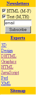
Compare the Diamonds.com navigation to Burpee.com. What are the similarities? the differences? Find different sites with complex navigation and study the menu areas, keeping in mind the points that we have discussed with this article. If you spend some time studying why some navigation works, and why some feel awkward to use, your sites will improve dramatically. Plan, plan, plan. Test, test, test. It is worth it. There is a direct relationship between a designer's ability to create complex and user-friendly navigation and their success in the industry. Clients are increasingly aware that they must invest in a comfortable and easy to use site in the same way that brick and mortar businesses pay great attention to the image and usability of their space. Get searching for those great examples. Our own WebReference front page, shown at the left, is not a bad place to start for a variety of menus directing people who want information fast. (And fast it is, using only text and <td> backgound color to present menus.) IBM has created a navigation masterpiece, shown below, and well worth close study.
Review your current sites, and if you have never created a site map, do so now. Perhaps you can find better ways to structure your site. Try to place yourself in your visitor's shoes. What do you see? What is the natural navigation route? If you have a comprehensive site statistic log, check where your visitors exit. Which pages get the most traffic? Does the traffic pattern make sense, or is it possible that visitors are getting lost and exiting prematurely? If you can see problems in your statistics or through your site map, can you apply some of the organizational tricks we looked at in this article? Use your site map to visually trace out natural patterns. Sometimes failing to provide one link between your pages can sabotage your traffic flow and cause you to lose visitors before the site objective has been met. |
|
|
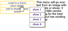
The pop-up menu creation feature in Fireworks has exciting potential for problem menu areas. We will look at this feature in the next tutorial. |
Next time, we will look at the practical end of creating menus. I will step you through creating image map graphics, and creating image maps in Photoshop, ImageReady and Dreamweaver. We will also cover preparing graphics for rollovers and complex rollover effects. Small text, what works and what does not, is on the future agenda, and how to make all menu items more legible. Make sure you check back for the exciting pop-up menu feature in Fireworks 4, shown at the left. This is not a small subject, but it is an exciting one. Not only does your professional reputation go up when your navigation skills improve, but you drastically cut the time it takes to create a site. That sounds like a better bottom line to me! |
|
|
|
Menus with Beauty and Brains Tutorial IndexMenus with Beauty and Brains: the Heart of an
Excellent Site |
URL: https://www.webreference.com/graphics/column42/
Created: February 04, 2001
Revised: February 04, 2001


 Find a programming school near you