How to Create User Friendly Web Sites | 4
[previous] |
How to Create User Friendly Web Sites
Underestimate Your Users' Technical Knowledge
People are much more apprehensive about technology than you might think. Most people veer away from downloading plug-ins and clicking on unknown elements for fear of viruses, and because they dislike the long downloads.
Don't count on people to download new plug-ins. Adults fear viruses, spyware, and spam. Some schools actually block students from accessing multimedia content or downloading plug-ins. Parents warn their children against downloading anything on the family computer, for fear of contaminating it. Some users also automatically assume that there is a charge to download plug-ins, even when they're free.
If there's a compelling reason to require a specific plug-in or software, choose one that's common on most machines. It takes time for people to upgrade their system to the latest versions of software. Pick a version that's one iteration behind in order to capture a broad audience. The best solution is to provide non-multimedia content alternatives to people who don't have the proper plug-ins.

Deceptive dialog boxes such as these make it difficult for people to distinguish between a legitimate and unscrupulous security message. With virus scares proliferating, it's not surprising that people are fearful of downloading anything from the Web. (Did you notice the subtle word "advertisement" in the lower right? Most users don't.)
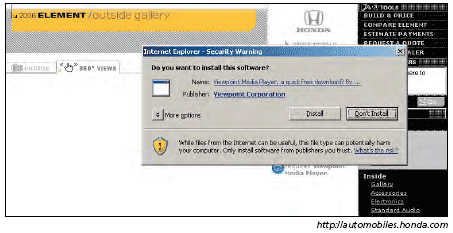
People are bewildered by security messages such as these. They're concerned about installing anything harmful but aren't sure whether the warning pertains to them. Some might install it in the hopes that nothing bad will happen; others might not take the chance and abandon the feature altogether.
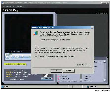
People don't understand what messages like this mean. When people selected Play in the original window, they expected that the video would play automatically, not require them to commit to additional steps. To avoid messages like this getting in the way of your content, it's best to use file formats that are one or two versions behind the newest versions of the popular media players.
Detect Users' Bandwidth
Don't require your users to select the bandwidth; many don't know what that means or how to find out, or they're using a borrowed computer and don't know the system's bandwidth. Asked to select the player or bandwidth speed appropriate for the media they want to play, many participants simply guess.
Take the guesswork out of the equation by measuring the user's connection speed in the back end and setting a cookie value accordingly. Give people with slow connections functionality geared toward low-bandwidth users. People who have faster load times can better handle the more robust version. Unfortunately, automatic bandwidth detection is still difficult with current technology, so in most cases, you're still best off aiming for a lower common denominator. But in two instancesÂwhen download delays would pose a major problem for narrowband users, or when you'd gain substantial additional benefits from a "fat" version of the application for broadband usersÂit's worth the additional effort.
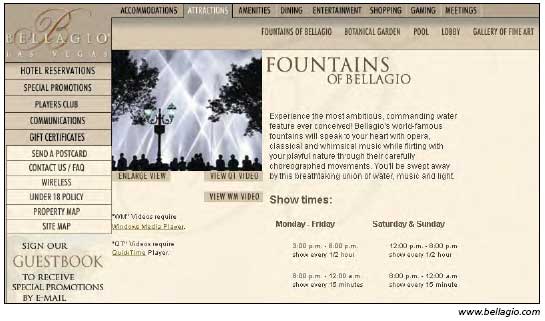
Most users don't know the difference between QuickTime and Windows Media Player. Even worse, this site abbreviates these terms, making them more obscure. It's better to remove the guesswork from the interface and let people see videos without having to select mysterious settings.
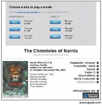
The video options on this page are overwhelming and too technical for average users, who don't know what 480p, 720p, and 1080p mean or how those numbers pertain to them. The "p" stands for progressive scan video, but this is too technical for people to know. The file size indicators might give people a clue, but they still don't tell people which format works best on their system.
People expect videos to play without them having to choose between options that are meaningless to them. If you offer different video sizes, it's best to identify them with simple words such as "big" and "small" because they refer to a concrete and observable aspect of making the choice. It also helps to tell users that the small version downloads the quickest.
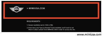
This splash page reminds viewers that they must have a specific screen resolution setting and have pop-up blockers disabled in order to access the site. This implementation is problematic for several reasons. First, most users won't even notice the message (as the instructions are in tiny letters and difficult to read). If they do notice it, they probably won't understand what it means. Then, too, many people don't know how to change their settings. Finally, a majority of people have pop-up blockers installed and won't even be able to access this site. Better to have a flexible design that works on most reasonable settings.
Excerpted from Prioritizing Web Usability by Jakob Nielsen and Hoa Loranger. Copyright © 2006 Jakob Nielsen. Used with the permission of Pearson Education, Inc. and New Riders. All rights reserved.
Created: March 27, 2003
Revised: May 29, 2006
URL: https://webreference.com/programming/web_usability/1


 Find a programming school near you