How to Create User Friendly Web Sites | 3
How to Create User Friendly Web Sites

Design for Your Audience's Connection Speed

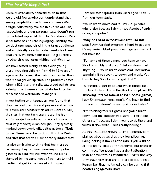
Statistics show that almost half of Web users still have dial-up Internet access, especially at home. While this proportion is dropping as more and more users get broadband access, it's important to keep in mind that many of your site's users still have slow connection speeds.
Connections may be slow even in broadband situations, such as in wireless connections, or in educational institutions, where response times can be slow due to factors such as bandwidth sharing, servers, and filters. Many media files are big and take a long time to download. Even with broadband connections, participants in our studies complained about slow download times and often abandoned a site or video because it took too long to load.
Bottom line: Optimize file sizes and minimize loading time. Even if you have designed a useful and intuitive interface, long response times can doom your project.
Provide a Simple and Accurate Loading-Status Indicator
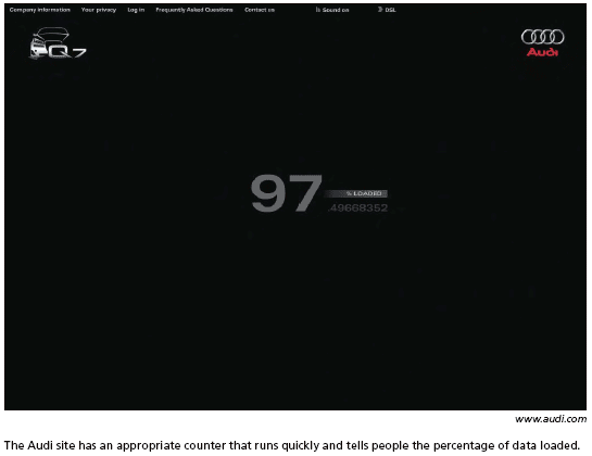
You can often minimize people's impatience during long downloads simply by having a status indicator to provide visual feedback. A well-designed indicator reduces the perceived loading time because people see the progress and know what to expect. Keep it simple. It's most helpful to show the actual percentage of data transferred (for example, "50% loaded") so that users can assess how much more time the download will take. Impatient users leave sites that don't provide adequate feedback, often assuming the site is down because the page appears frozen. If they can see that the site is working, they tend to wait longer.


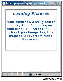
The information in this dialog box is vague and there's no animation or status indicator to let people know the system is working. It's impossible to tell how long the process will take or if the pictures are actually loading.

Travelocity doesn't have a status indicator. It's difficult to tell how long the process will take, but the twinkling stars give people some hope that the system is working. This is not a huge problem if the process is relatively quick. However, for long wait times, having an accurate indicator would minimize the perceived time, and people would be more likely to continue waiting.
Created: March 27, 2003
Revised: May 29, 2006
URL: https://webreference.com/programming/web_usability/1


 Find a programming school near you