How to Create User Friendly Web Sites | 2
How to Create User Friendly Web Sites
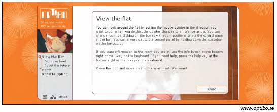
Lengthy instructions such as these indicate that the interaction design is too complex. People won't read them. If they can't figure out how the application works within a few seconds, they're gone. Better to simplify the interaction than to add more instructions.
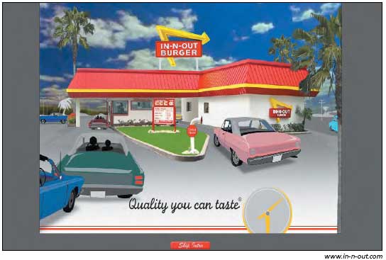
Originally the In-N-Out site launched with the company's theme song repeated several times while cars moved through the drive-thru line. As we were finishing this chapter, the company changed the design: Now the theme song only plays once, which is more than enough. Maybe it had received too many complaints about the previous design. In any case, this splash page remains useless because it serves no purpose to the user. There's a Skip Intro button, but why waste people's time with this gratuitous screen in the first place? People are better served with Web sites that start on the homepage. (In-N-Out's homepage is, in fact, pretty good, and it would have been much better if it offered the theme song via a button there instead of forcing users through a splash page.)
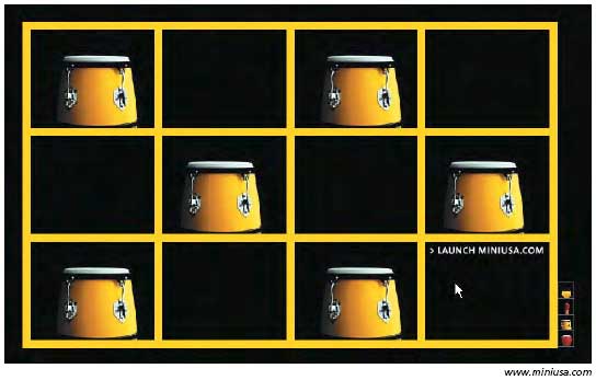
The splash page on the Mini USA site was interactive. Moving the cursor over each graphical element prompted movement and sound. People could switch between the pictures by clicking on the icons on the lower right side of the screen.
Cool, right? Wrong. People in our study didn't know how to get past this screen. They clicked on the pictures, but nothing happened. You might think that Launch MiniUSA.com is so obvious, how can anyone not see it? The answer: Because "launch" is a technical term that some people don't recognize. One user complained:
"Are we talking about a car here? I'm trying to get on the Web site to see the actual car. But I can't get in it. It won't let me in . I don't know what the matches and drums are all about. If it has anything to do with cars it's weird. Bees, matches, and drums have nothing to do with cars."
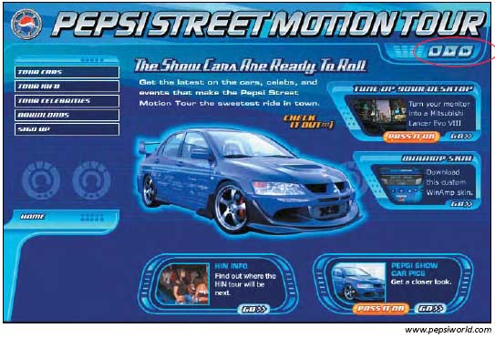
Designers shouldn't assume that users would know what the audio control buttons in the upper right corner are meant for. People in our study accidentally selected arrow icons and were startled when audio turned on. Better to include text labels that say On, Off, and Pause. If your design uses resemblance icons to leverage a metaphor, it's best to maximize the resemblance by ensuring that the graphics look like the referenced system. In this case, they should look like the control buttons on a VCR or other consumer electronics. Such buttons are almost always square or rectangular.
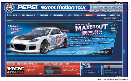
The redesign of the Pepsi Street Motion Tour put text labels on the button controls, making it less likely to cause user errors.
Overcoming Barriers to Multimedia
MultimediaÂor to use the more current term, rich media Âcan be instructive and engaging in ways static HTML pages cannot. Audiences appreciate audio on music sites, configurators on automotive sites, videos on entertainment sites, and virtual tours on hotel and real estate sites. Music and movie sites benefit particularly, because users can sample their products online. To use them wisely, you must take into account your users' equipment and needs.
Accommodate Low-Tech Users
In field studies where we visited people's homes, workplaces, and school environments, we discovered that many people work on old hand-me-downs or donated equipment that runs slowly and doesn't have the required plug-ins and applications to take advantage of advanced features. For example, many sites designed for children and teens offer multimedia and interactive features, but because young people often use old or borrowed computers, they don't benefit from these features. For this reason, make sure to provide alternative content for your users who lack access to the multimedia.
Also, use sound to complement your site, not as a primary way to deliver content. In almost all teen homes that we visited, teens didn't have speakers attached to the computer or they had them turned off so they could listen to the radio. If you're going to have a demonstration that uses sound, make sure it has a text version as well, so students can follow along without having to depend on the audio.

Created: March 27, 2003
Revised: May 29, 2006
URL: https://webreference.com/programming/web_usability/1


 Find a programming school near you