3D Animation Workshop: Lesson 113: First Look at MAX 4 | 2
|
|
Lesson 113 - First Look at MAX 4 - Part 2
I'm currently immersing myself in MAX 4, and will be sharing my observations over the next few columns.
The MAX 4 interface is not substantially different than MAX 3's, but some improvements are worth nothing. The most important, from my point of view, is a transform display and type-in feature that resides permanently at the bottom of the MAX screen.

I always hated having to open up Transform Type-in dialog boxes to check or change transform values. This kind of basic information (and control) should always be on the screen - and now it is. You can easily read and change x, y and z values for position, rotation and scale. This is the kind of minor improvement that makes a big difference.
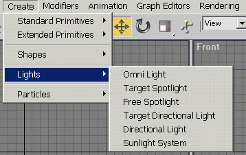
Another notable change is a complete dropdown list of all modifiers, instead of the selected set of modifier buttons. You can still use button sets if you wish, but the dropdown list saves priceless screen space in the Command Panel. In fact, the menu bar has been expanded to make it easier to hide the entire Command Panel. You can now access most of the Create options and the modifiers directly from menus.

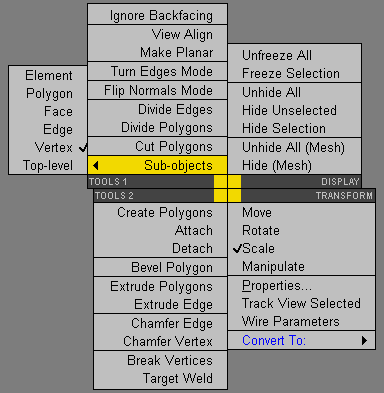
A more debatable improvement is in the ambitious right-click menus. I generally love right-click, context-sensitive menus, of which Nendo's are the ideal. MAX 3 really improved the program in this regard, but MAX 4 may be taking it too far. You get to the point where a right-click menu is too complicated to be useful, and you find it easier to use the standard interface tools elsewhere on the screen. Here's a screenshot of a right-click menu for an Editable Mesh object.

| To Continue to Part 3, or Return to Part 1, Use Arrow Buttons |
|
Created: February 27, 2001
Revised: February 27, 2001
URL: https://webreference.com/3d/lesson113/2.html


 Find a programming school near you